What Makes a Color Palette “Mid Century Modern”?
When we think of Mid Century Modern design, one of the first things that comes to mind is its iconic use of color. But what exactly makes a color palette fit this style?
Balancing Earthy Tones with Bold Accents
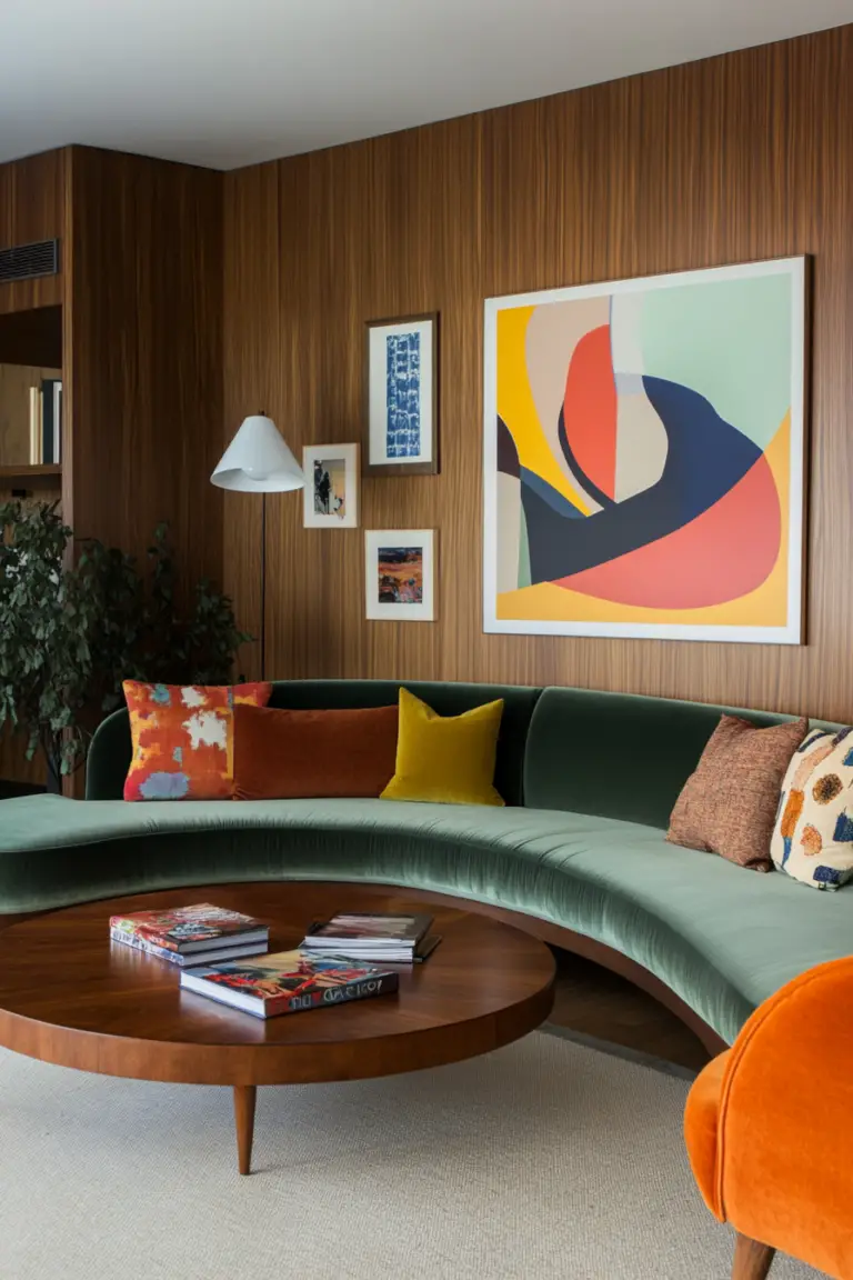
Mid Century Modern color schemes masterfully combine earthy, neutral tones with vibrant, playful accents. Think warm hues like mustard yellow, burnt orange, and rich browns, balanced by cooler shades such as teal, olive green, and cobalt blue. This mix creates a sense of harmony, blending natural, grounded elements with the bold, innovative spirit of the mid-20th century.
The Essence of Mid Century Modern Colors
The key lies in creating balance. Neutral tones provide a calming backdrop, while vibrant accents inject energy into the space. This contrast mirrors the era’s emphasis on functional design with a touch of artistic flair.
How Can Black Be Incorporated into a Mid Century Modern Color Scheme?
Black might not be the first color you associate with Mid Century Modern design, but it plays a surprisingly essential role. Here’s how to use it effectively.
Black as a Sophisticated Anchor
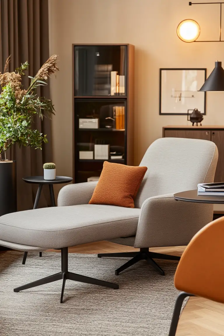
While it’s rarely the star of the show, black often acts as an anchor in Mid Century Modern interiors. It grounds the palette and adds a sense of sophistication to the design. Black pairs beautifully with vibrant colors, providing a contrast that enhances the surrounding elements.
Creative Ways to Incorporate Black
You’ll often see black in furniture frames, cabinetry, or as accents in lamp bases, picture frames, or decorative objects. For an added touch of elegance, combine black with metallics like gold. This pairing creates striking visual depth and a timeless, chic look.
Are Pastel Colors Suitable for Mid Century Modern Interiors?
Bold colors often steal the spotlight in Mid Century Modern design, but pastels have their place too. So, how do you incorporate these softer shades without losing the distinctive character of this style?
The Charm of Soft Blues and Pinks
Pastel hues, especially soft blues, are a subtle yet effective way to create a calming and subdued atmosphere. Similarly, pastel pinks can serve as a neutral backdrop that complements iconic Mid Century Modern furniture.
Balancing Pastels with Natural Elements
To keep the look cohesive, pair pastels with natural wood tones or bolder accents. For example, a pastel blue wall can provide a serene background, while a mustard yellow chair or a walnut coffee table adds warmth and contrast. This balance maintains the playful, functional aesthetic that defines the style.
1. Mustard Yellow and Teal
Why It Works
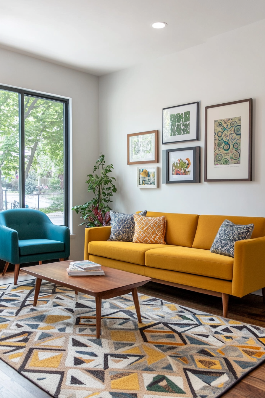
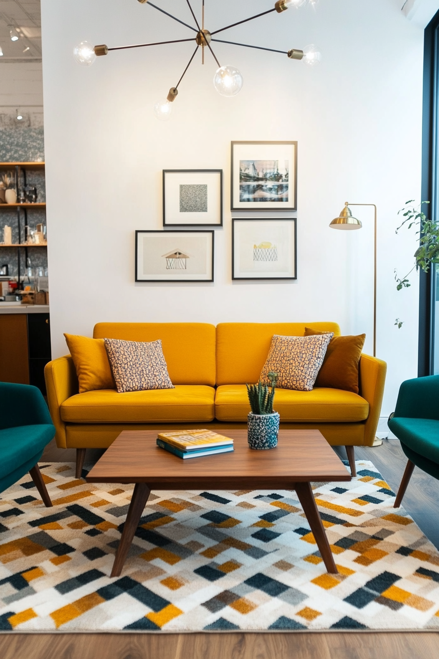
Mustard yellow and teal create a bold and vibrant contrast, perfectly embodying the retro-modern vibe of mid-century design. Mustard yellow’s warm tones are balanced by the cool, rich depth of teal, resulting in a palette that feels nostalgic and fresh. This combination is ideal for statement furniture, accent walls, or even playful decor items.
How to Implement
A. Add Color with Furniture
- Mustard Yellow Sofa: Invest in a mustard yellow sofa to anchor your living room with retro flair.
- Teal Armchairs: Pair with teal armchairs for complementary seating arrangements.
B. Use in Soft Furnishings
- Throw Pillows: Mix mustard yellow and teal throw pillows on neutral furniture for a pop of color.
- Area Rugs: Look for rugs with geometric patterns in these shades to tie the room together.
C. Add Small Accents
- Wall Art: Choose artwork with mustard yellow and teal highlights to subtly introduce the palette.
- Ceramic Vases: Place teal and mustard vases on side tables or shelves for a cohesive look.
Styling Tip
To keep the palette cohesive, use warm-toned woods like walnut for furniture and accents.
2. Orange, Teak, and Cream
Why It Works
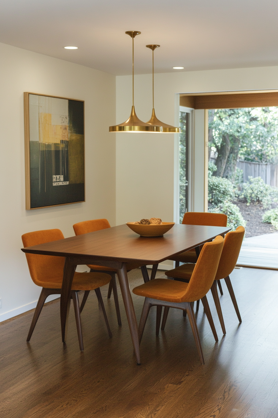
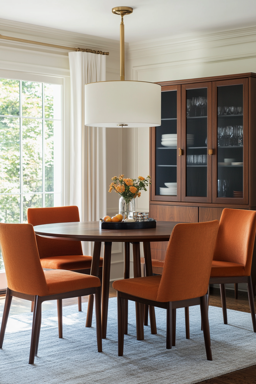
This warm trio combines the richness of orange, the natural beauty of teak wood, and the softness of cream. It’s an inviting palette that brings warmth and sophistication to any room. The balance of bold and neutral tones ensures the look is eye-catching but not overwhelming.
How to Implement
A. Highlight with Paint
- Orange Accent Walls: Use a muted orange for a striking yet sophisticated statement.
- Cream Walls or Trim: Keep walls or trim neutral in cream to balance the boldness.
B. Focus on Furniture
- Teak Sideboards: Incorporate teak wood furniture like sideboards or coffee tables.
- Orange Upholstery: Select chairs or sofas with orange fabric for a retro touch.
C. Use in Accessories
- Textiles: Add cream and orange patterned curtains or cushions.
- Decor Items: Place teak-framed mirrors or orange ceramics for subtle detailing.
Styling Tip
Pair this palette with brass or gold metallics to enhance the warm tones.
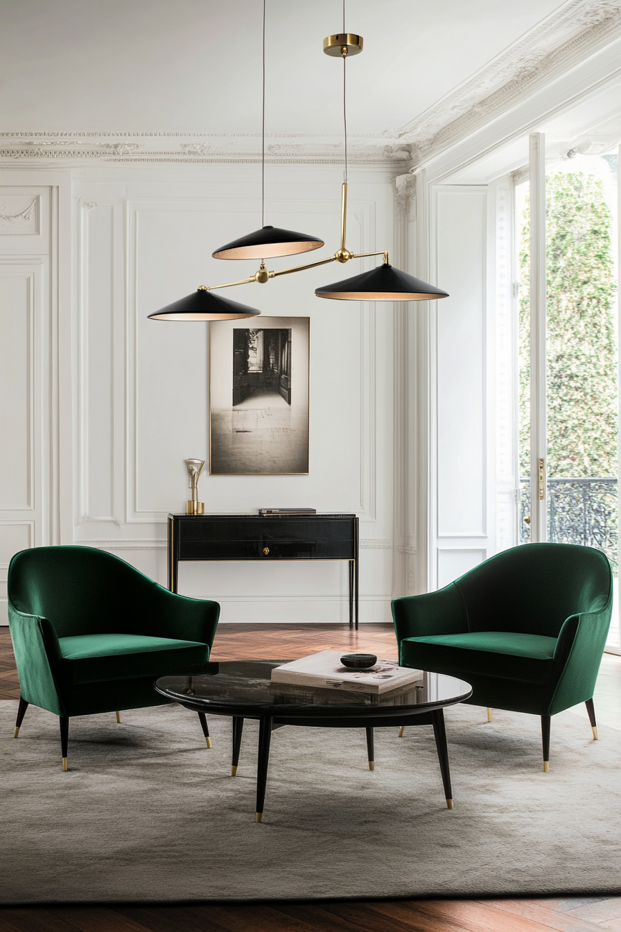
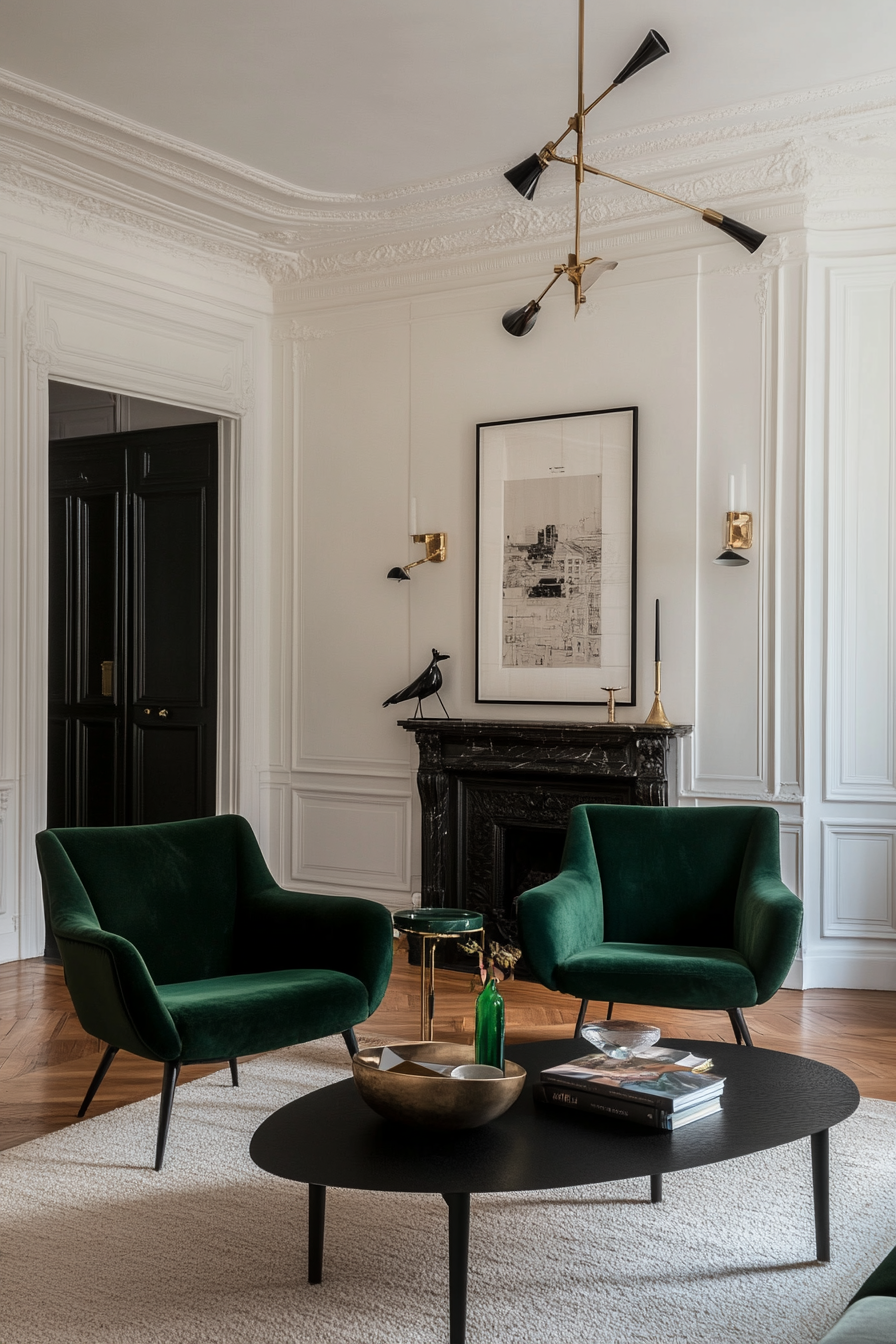
3. Emerald Green with Black Accents
Why It Works
Emerald green brings a lush, rich tone to your space, perfectly complemented by the sleek sophistication of black accents. This palette feels luxurious and grounded, offering a timeless appeal. It works particularly well in living rooms or dining areas where drama and elegance are desired.
How to Implement
A. Feature Walls
- Emerald Green Walls: Use emerald green for a bold, grounding feature wall.
- Black Trim: Incorporate black trim or moldings to frame the space elegantly.
B. Furniture Choices
- Green Velvet Furniture: Opt for emerald green upholstered chairs or sofas.
- Black Wood Tables: Include black-painted wood tables for a strong, chic contrast.
C. Accessorize Thoughtfully
- Green and Black Artwork: Choose wall art that incorporates both colors to tie the look together.
- Metallic Touches: Add brass or gold lamps for a touch of warmth and elegance.
Styling Tip
Balance the rich tones with white or cream textiles, such as rugs or curtains, to keep the space from feeling too dark.
4. Purple, Tan, and Brass
Why It Works
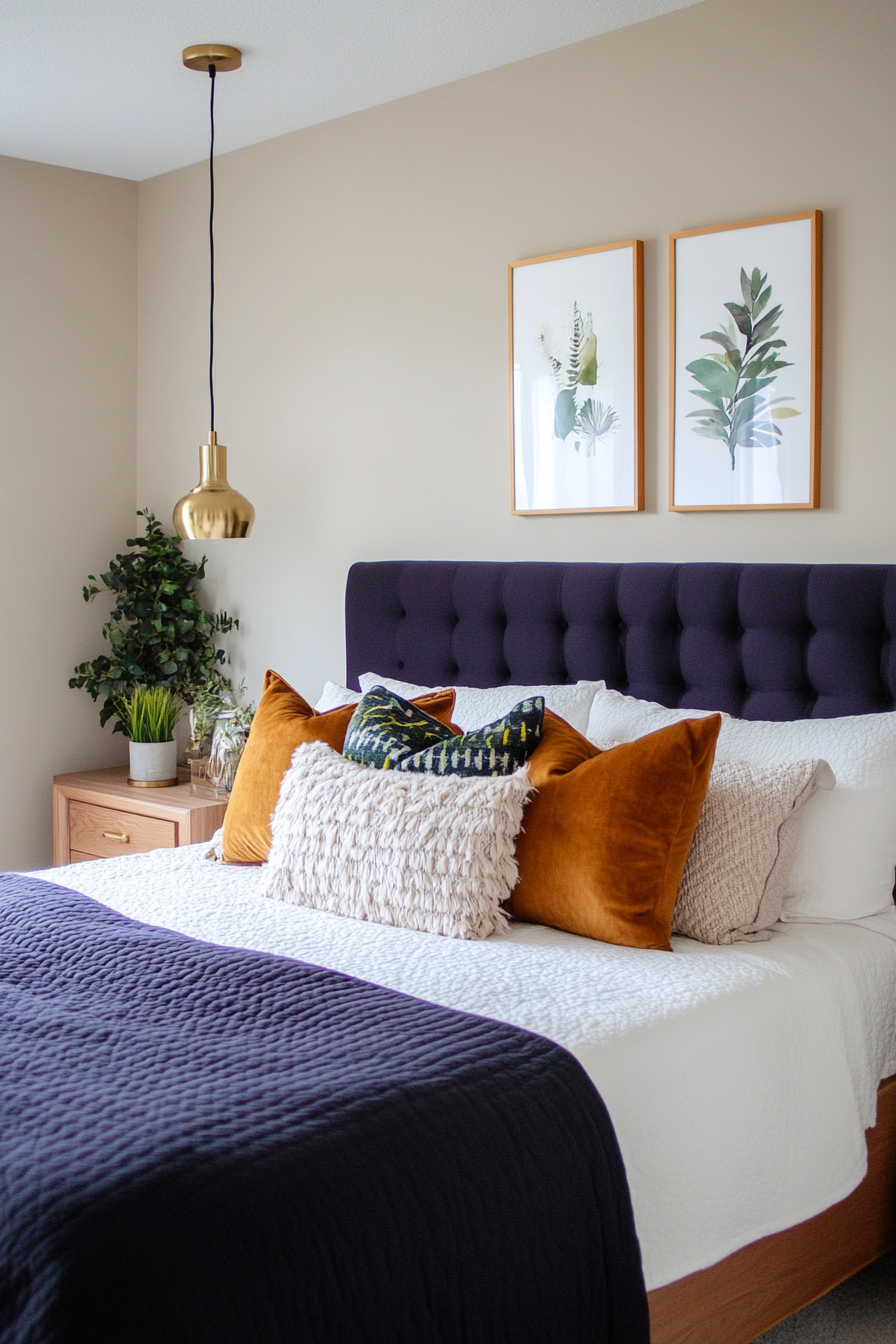
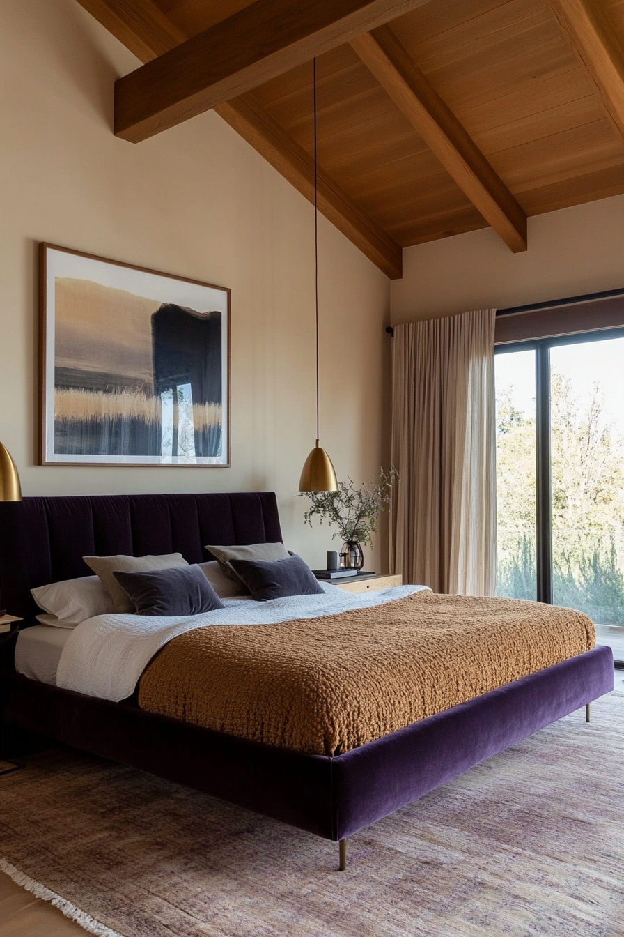
The regal tones of purple pair beautifully with the earthy neutrality of tan and the shiny elegance of brass. This palette feels refined and warm, making it an excellent choice for bedrooms or intimate sitting areas. The brass elements add just the right touch of mid-century glamour.
How to Implement
A. Use in Textiles
- Plush Purple Upholstery: Use deep purple for armchairs, cushions, or headboards.
- Tan Area Rugs: Opt for soft, neutral rugs in tan to anchor the room.
B. Highlight with Brass
- Lighting Fixtures: Incorporate brass pendant lights or lamps for a luxe touch.
- Decor Accents: Use brass vases, mirrors, or picture frames to add shine.
C. Wall Treatments
- Tan Walls: Keep walls light and neutral with a tan or beige shade.
- Purple Accents: Add purple artwork or small decorative items for a cohesive look.
Styling Tip
Mix textures like velvet, leather, and brass to add depth and variety to this luxurious palette.
5. Burnt Orange and Olive Green
Why It Works
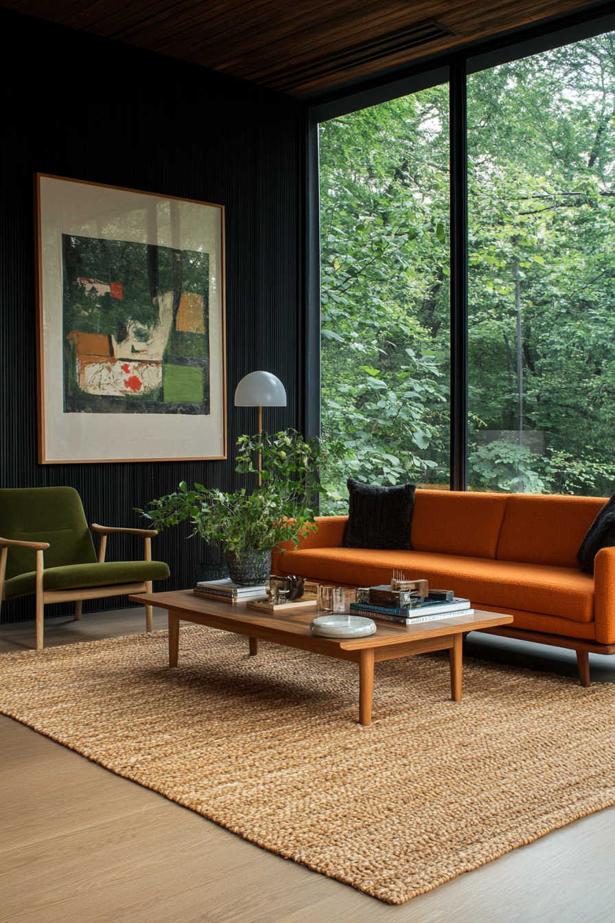
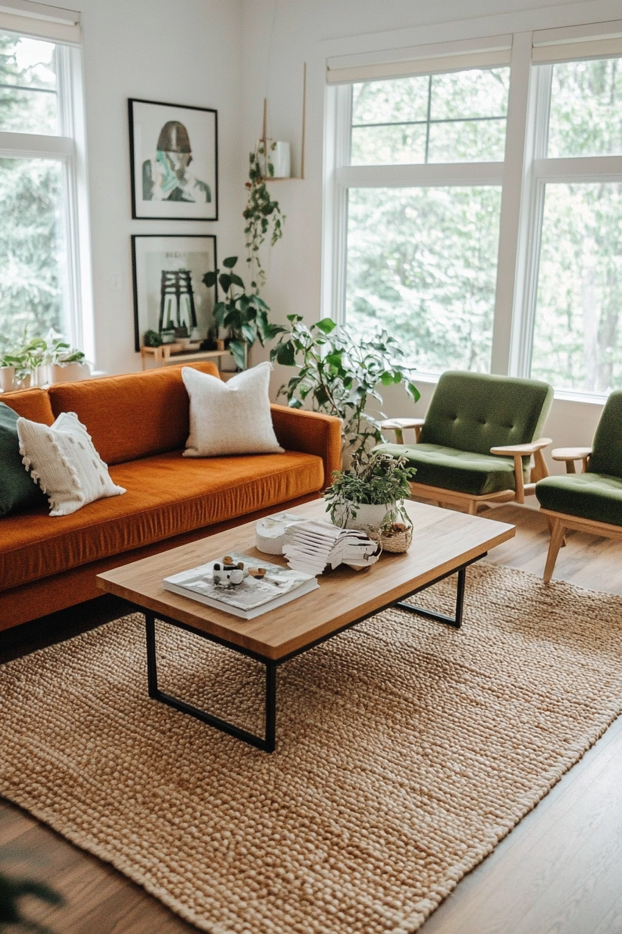
Burnt orange and olive green create a warm and earthy palette that feels timeless and grounded. The burnt orange adds vibrancy, while the olive green offers a soothing, natural balance. Together, they are ideal for creating inviting and comfortable spaces that channel the outdoors.
How to Implement
A. Furniture
- Burnt Orange Sofa: Anchor the room with a sofa in this rich, warm shade.
- Olive Green Chairs: Add olive green chairs or a loveseat for balance.
B. Wall Colors
- Olive Green Walls: Use olive green as a primary wall color for a calming effect.
- Burnt Orange Accents: Add burnt orange in smaller areas, like trims or door frames.
C. Decor Details
- Patterned Textiles: Choose throw pillows or curtains with both colors for cohesion.
- Natural Wood Furniture: Complement the palette with medium-toned wood for added warmth.
Styling Tip
Bring in woven textures like rattan or jute for an added layer of organic charm.
6. Cobalt Blue and Turquoise
Why It Works
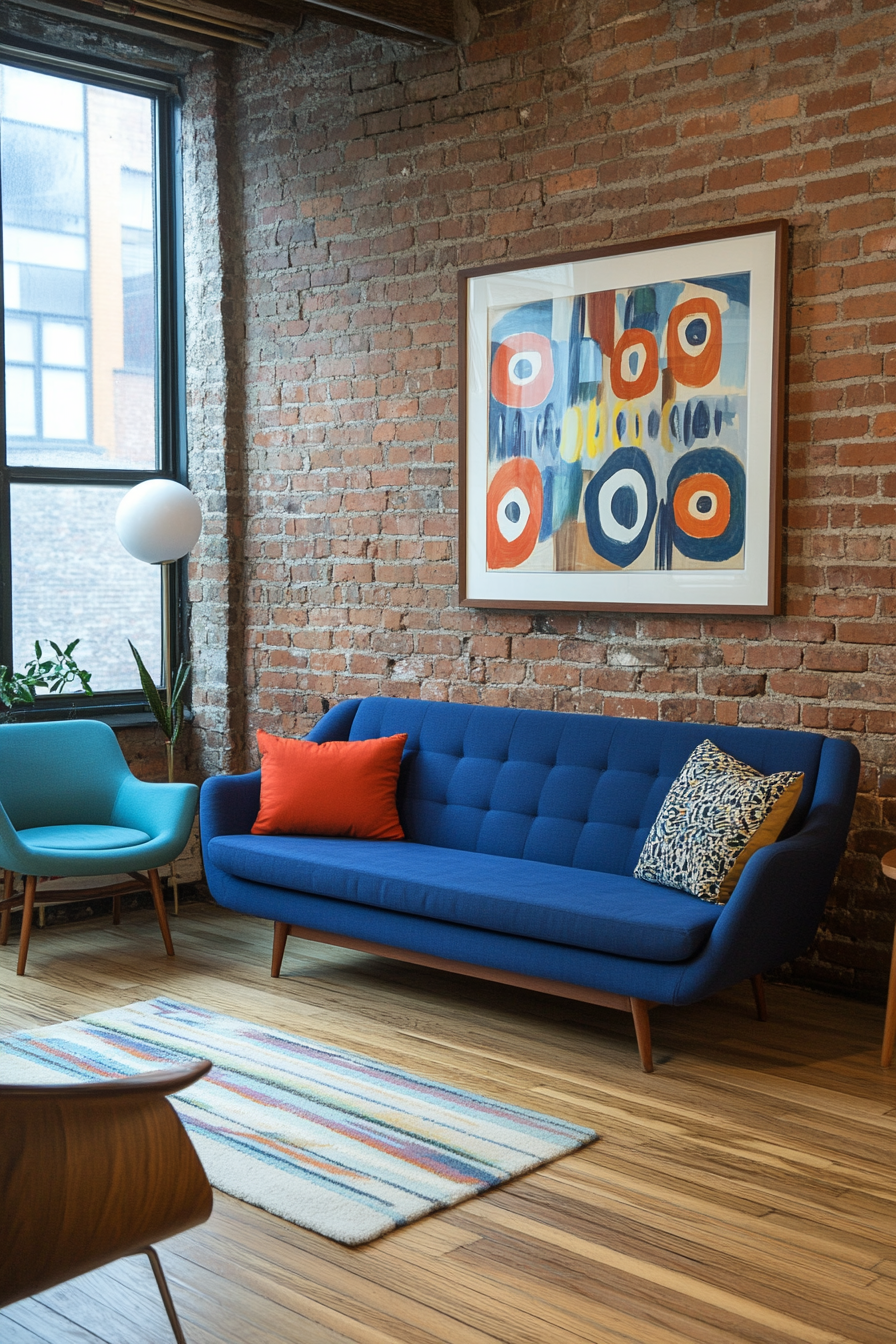
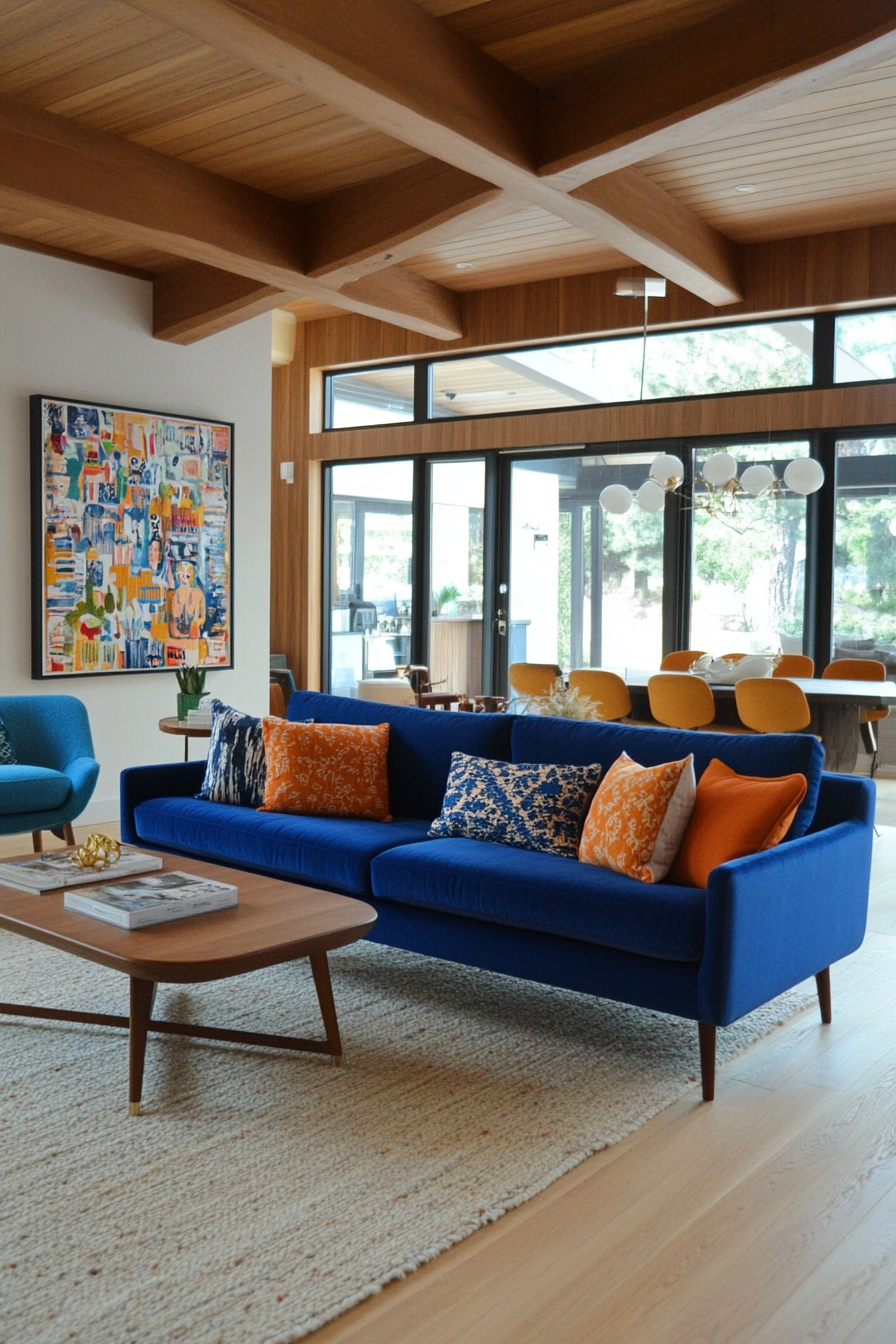
Cobalt blue and turquoise create a refreshing and dynamic palette. The intensity of cobalt blue is softened by the breezy brightness of turquoise, making the pairing energetic yet balanced. This combination works wonderfully in spaces where you want to evoke a playful, retro vibe with a contemporary edge.
How to Implement
A. Walls and Flooring
- Turquoise Walls: Paint walls turquoise for a light and airy feel.
- Neutral Flooring: Pair with neutral or light wood flooring to let the colors stand out.
B. Furniture Focus
- Cobalt Blue Chairs: Add bold cobalt blue armchairs or dining chairs.
- Turquoise Upholstery: Use turquoise for sofas or ottomans to create a cohesive flow.
C. Decorative Accents
- Artwork: Choose abstract art with cobalt blue and turquoise tones.
- Throw Blankets: Use textured throws in these shades for extra comfort and style.
Styling Tip
Balance the boldness with white or gray accents, like curtains or vases, for a crisp and clean finish.
7. Warm Gray and Light Blue
Why It Works
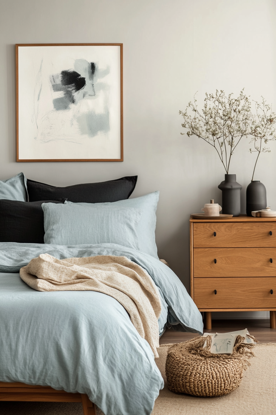
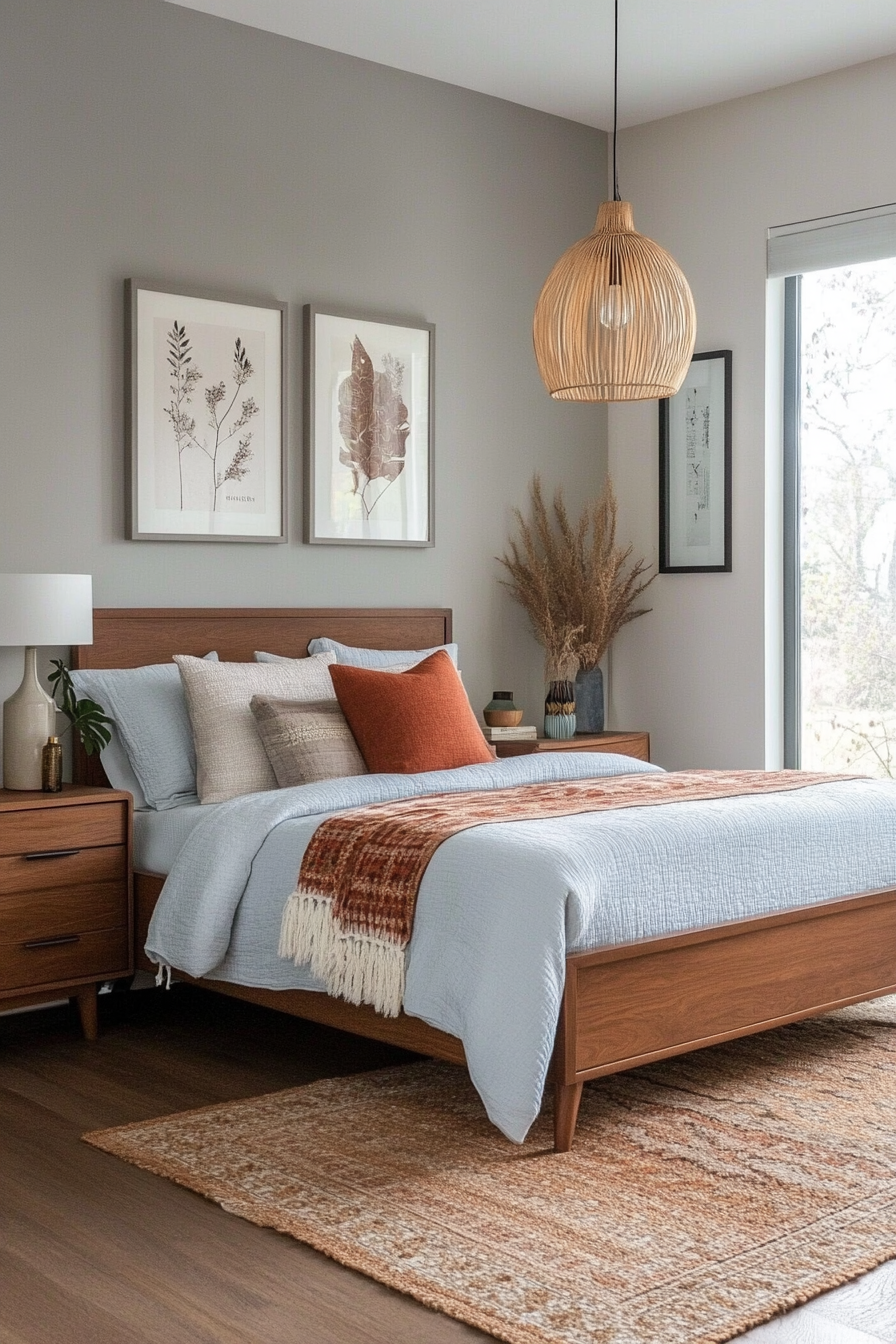
Warm gray and light blue create a subtle and calming palette perfect for relaxing spaces like bedrooms or reading nooks. Warm gray provides a neutral base, while light blue adds a touch of softness and tranquility. Together, they are understated yet elegant, embodying the simplicity of mid-century design.
How to Implement
A. Use on Walls
- Warm Gray Walls: Opt for warm gray as a neutral backdrop in any room.
- Light Blue Accents: Highlight trim, ceilings, or small walls with light blue for a refreshing contrast.
B. Furniture and Textiles
- Gray Furniture: Choose gray sofas or beds with clean, mid-century lines.
- Blue Accessories: Incorporate light blue throw pillows, rugs, or curtains to enhance the look.
C. Decorate with Soft Accents
- Blue Artwork: Select minimalist art pieces with blue tones.
- Ceramics: Place warm gray and light blue ceramics for subtle decor enhancements.
Styling Tip
Mix in natural wood elements to add warmth and texture to this serene palette.
8. Rich Gold and Earthy Taupe
Why It Works
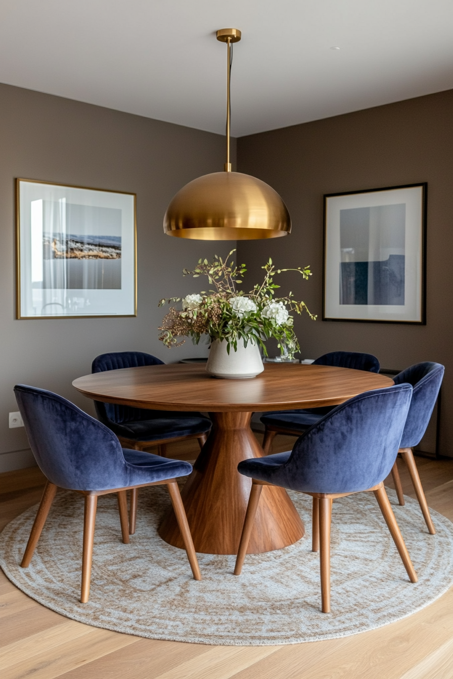
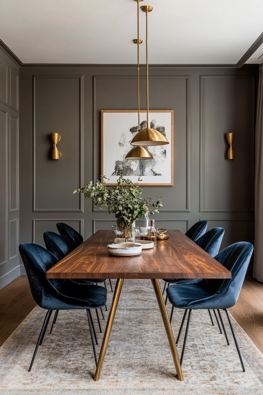
Rich gold and earthy taupe bring warmth and sophistication to your space. The luxurious sheen of gold accents complements the grounding neutrality of taupe, making this pairing a timeless choice. This palette is especially effective in formal spaces like dining rooms or offices.
How to Implement
A. Walls and Flooring
- Taupe Walls: Use earthy taupe as the primary wall color for a cozy foundation.
- Gold Highlights: Incorporate gold in trims or metallic wallpaper accents.
B. Furniture and Decor
- Taupe Upholstery: Choose taupe for sofas, chairs, or bedding for a versatile look.
- Gold Fixtures: Add gold hardware or light fixtures for a hint of luxury.
C. Decorative Elements
- Metallic Accents: Place gold vases, frames, or mirrors strategically to catch the light.
- Textured Fabrics: Use velvet or silk in taupe and gold for added depth.
Styling Tip
Layer in textures like wool or leather to keep the palette feeling warm and approachable.
9. Vibrant Maroon and Creamy White
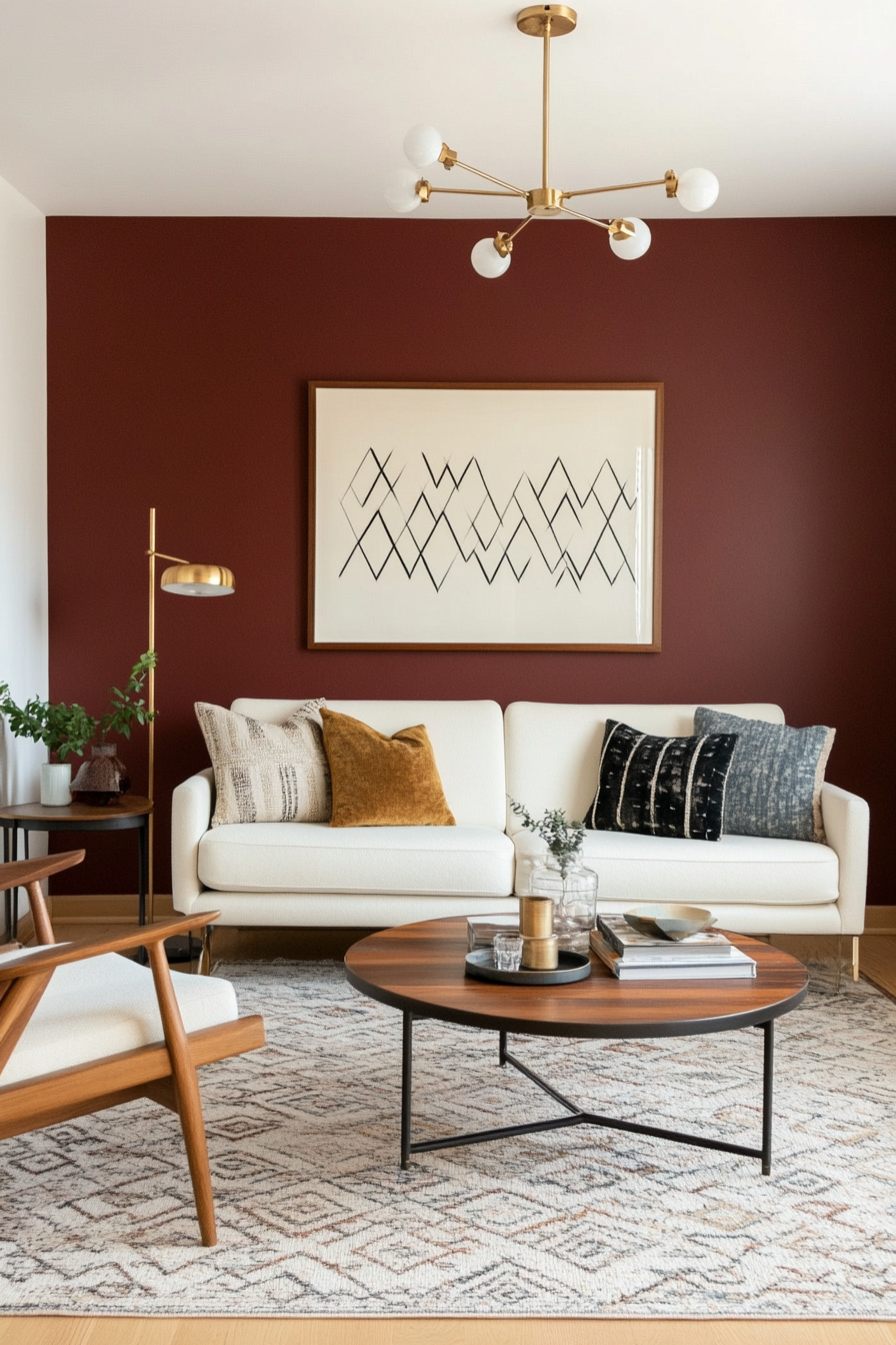
Why It Works
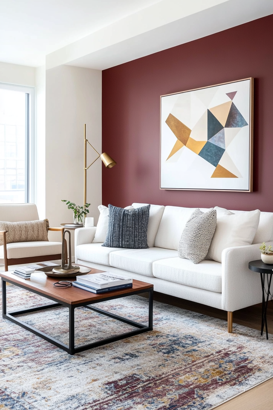
Maroon’s rich, dramatic tones are balanced beautifully by the softness of creamy white, creating a bold yet approachable aesthetic. This pairing works well for accent walls, furniture, and decor, making it versatile for both living and dining spaces. The neutral white lets the maroon shine without overwhelming the room.
How to Implement
A. Accent Walls
- Maroon Accent Wall: Paint one wall maroon to create a striking focal point.
- Creamy White Base: Use creamy white on the other walls to keep the space open and light.
B. Furniture Choices
- Maroon Sofa: Anchor the space with a maroon sofa or armchair.
- Cream Upholstery: Use creamy white for chairs, ottomans, or dining benches for contrast.
C. Decorative Elements
- Artwork: Choose abstract or geometric art featuring maroon and white tones.
- Ceramics: Incorporate maroon and white vases, bowls, or planters for cohesive decor.
Styling Tip
Enhance the palette with warm metallics like gold or brass for an added touch of mid-century charm.
10. Smoky Gray and Pastel Blue
Why It Works
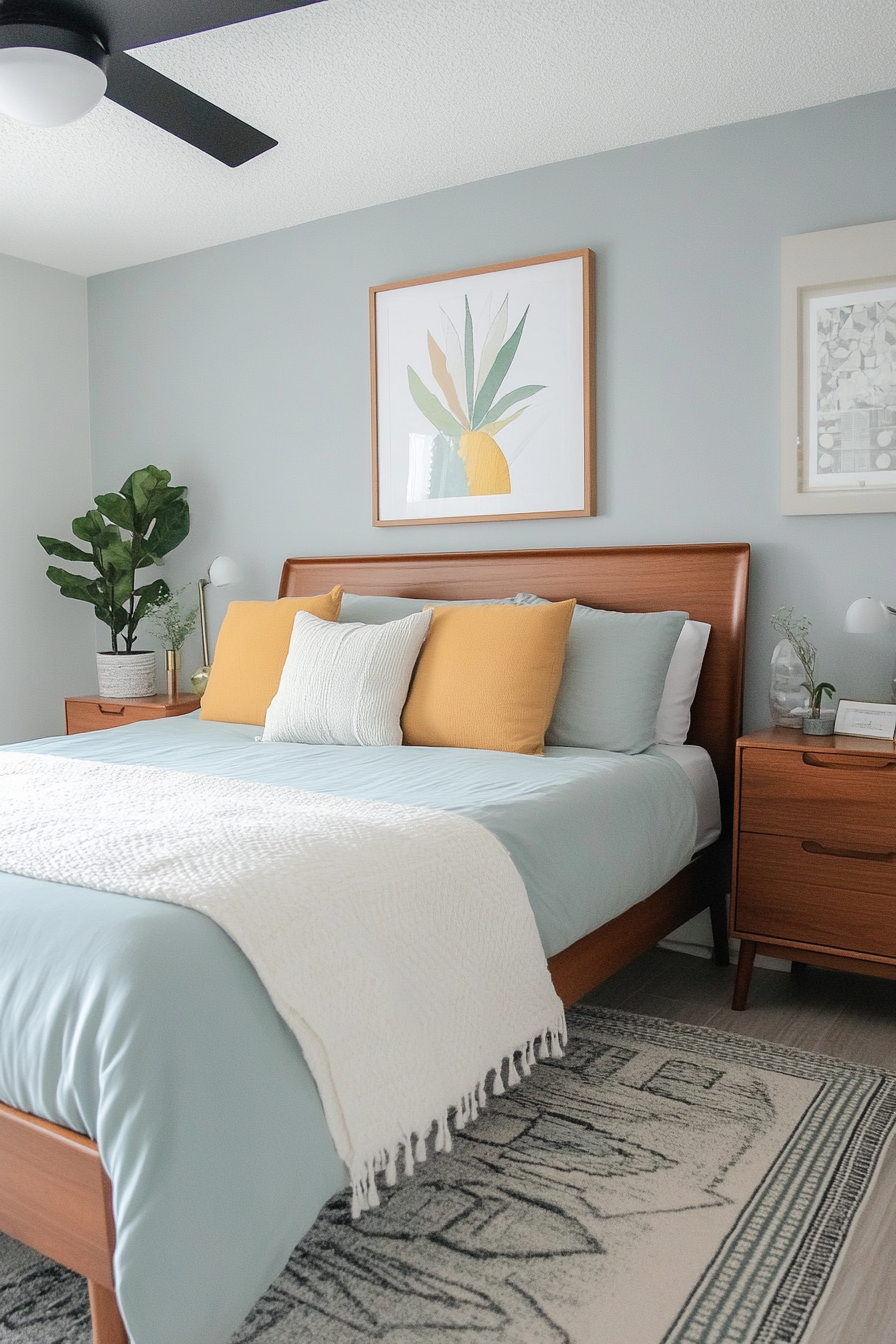
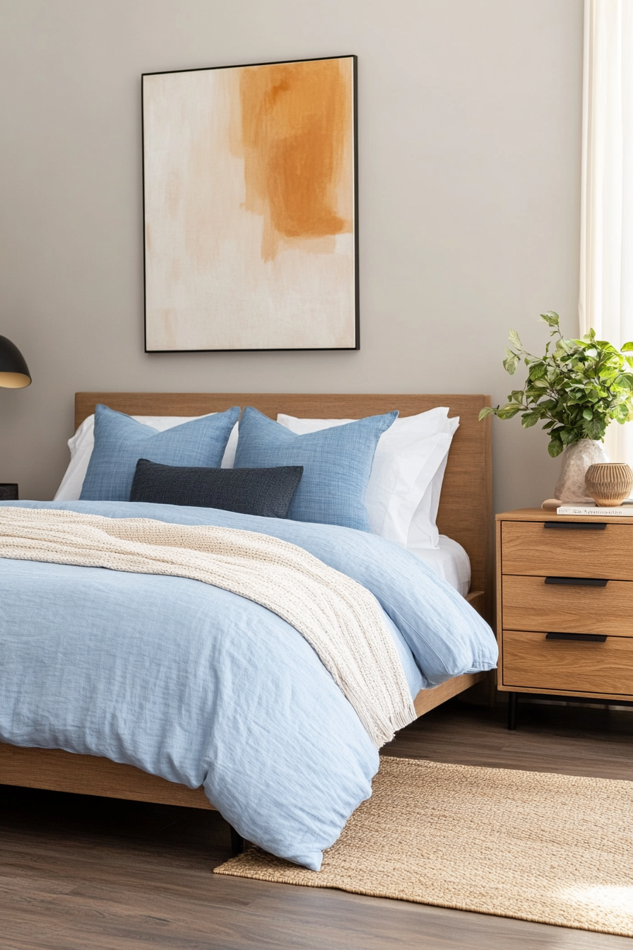
Smoky gray and pastel blue create a serene, minimalist vibe ideal for spaces that prioritize relaxation. Smoky gray provides a sophisticated foundation, while pastel blue adds a gentle pop of color without overwhelming the design. This pairing is perfect for bedrooms, offices, or modern living rooms.
How to Implement
A. Use on Walls
- Smoky Gray Walls: Opt for smoky gray as the primary wall color for a moody yet refined look.
- Pastel Blue Accents: Use pastel blue on a single wall or decorative panel.
B. Furniture and Textiles
- Gray Sofa: Choose a smoky gray sofa for a timeless centerpiece.
- Blue Cushions: Add pastel blue throw pillows or blankets for soft detailing.
C. Decor Choices
- Blue Artwork: Display abstract art with pastel blue highlights.
- Gray Ceramics: Use gray-toned pottery to enhance the minimalist look.
Styling Tip
Introduce natural textures like linen or jute to soften the overall aesthetic and add warmth.
11. Deep Red and Natural Wood Tones
Why It Works
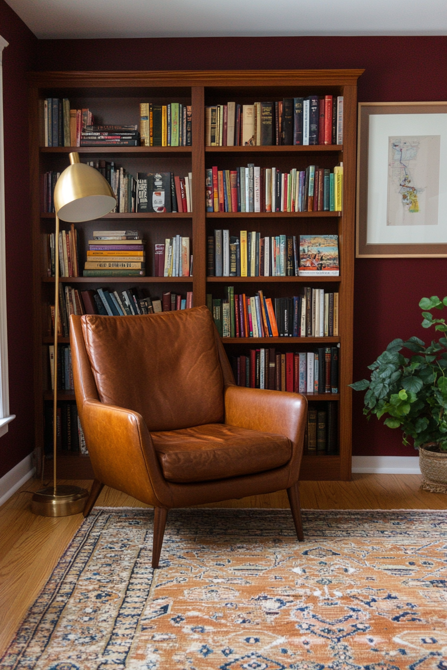
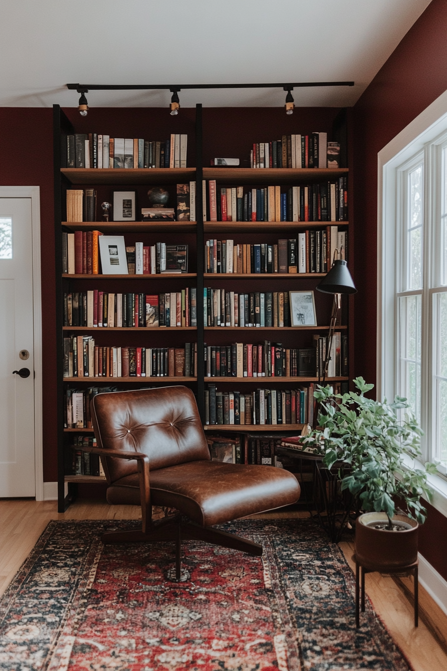
The warmth of deep red is enhanced by the organic charm of natural wood tones, making this palette a perfect fit for cozy, grounded interiors. The deep red brings richness and depth, while the wood tones add a tactile, timeless quality. This combination is great for living rooms, dens, or libraries.
How to Implement
A. Highlight Furniture
- Wooden Tables: Opt for mid-century wood furniture, such as walnut coffee tables or sideboards.
- Deep Red Upholstery: Use deep red fabric on chairs or ottomans for a dramatic pop.
B. Walls and Flooring
- Red Accents: Add deep red to accent walls or paneling for a bold touch.
- Wood Flooring: Let the natural wood grain of your floors shine with minimal treatment.
C. Small Accessories
- Throw Blankets: Choose deep red throws or cushions for subtle warmth.
- Wooden Decor: Add wooden sculptures, trays, or picture frames for consistency.
Styling Tip
Pair with warm lighting to accentuate the richness of both the deep red and natural wood tones.
12. Peach, Gold, and White
Why It Works
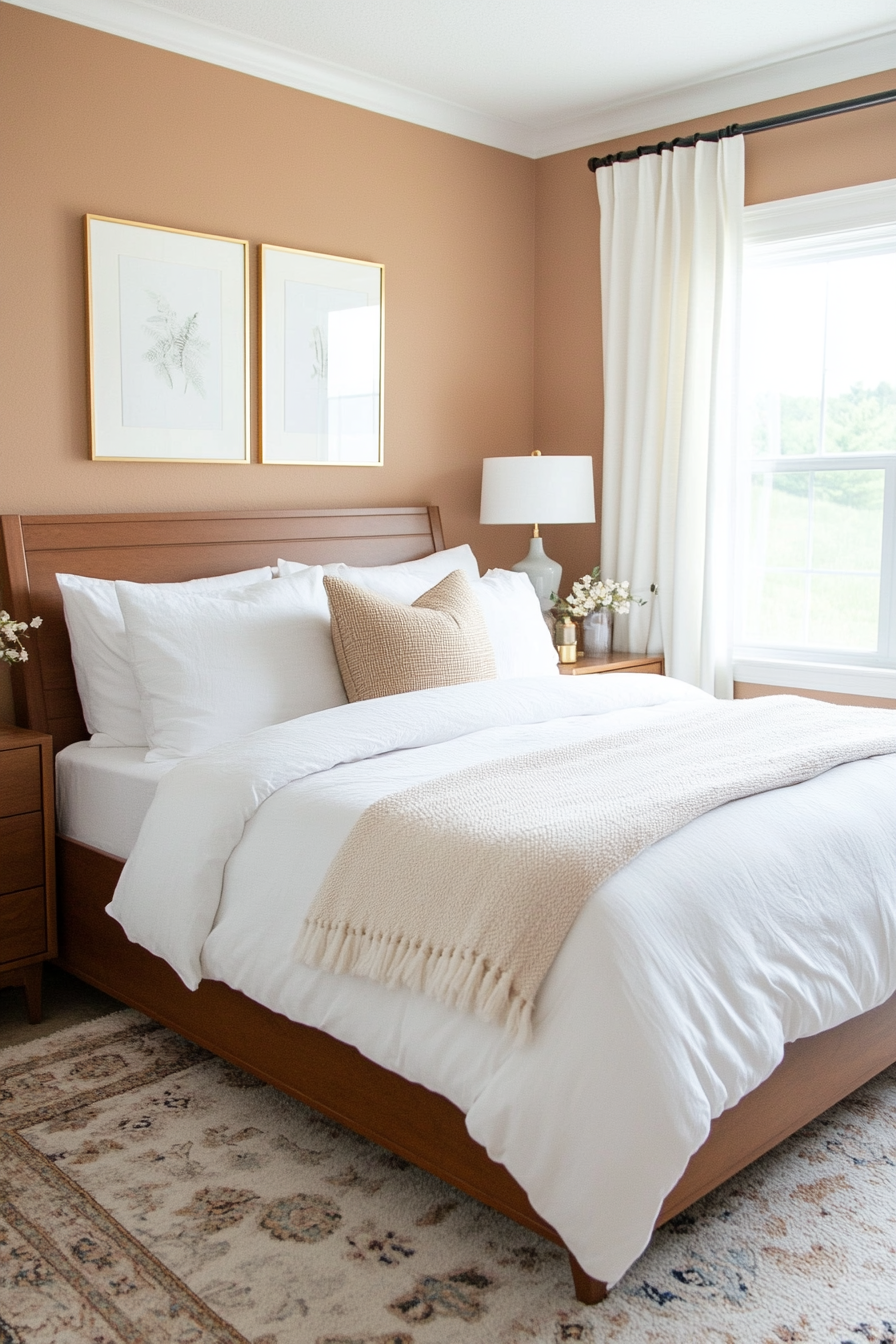
The warmth of peach pairs beautifully with the luxurious shine of gold and the clean neutrality of white, creating a soft and inviting palette. This combination works wonderfully in bedrooms, bathrooms, or any space that benefits from a calming and romantic touch.
How to Implement
A. Walls and Accents
- Peach Accent Wall: Use a soft peach tone on one wall to create a focal point.
- White Walls: Keep other walls white for a crisp, clean look.
B. Furniture and Textiles
- Peach Upholstery: Add subtle peach tones in armchairs, ottomans, or bed linens.
- Gold Accents: Incorporate gold in light fixtures or hardware for a touch of glamour.
C. Decorative Elements
- Peach and Gold Accessories: Choose vases, frames, or candles in these shades.
- White Textiles: Use white curtains or rugs to ground the space and keep it airy.
Styling Tip
Combine with soft lighting, such as warm-toned LEDs, to enhance the delicate warmth of this palette.
13. Primary Colors with Wood Accents
Why It Works
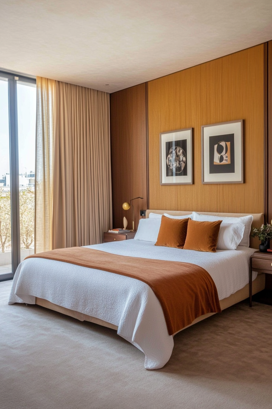
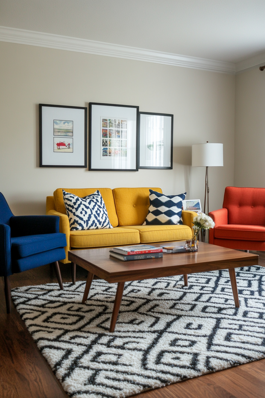
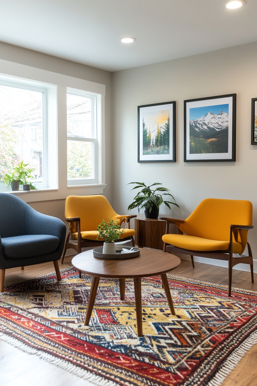
Primary colors—red, blue, and yellow—bring an energetic and playful vibe to mid-century design. Pairing these bold colors with natural wood tones helps ground the space and keep it from feeling too overpowering. This palette is perfect for family rooms or creative workspaces.
How to Implement
A. Use in Furniture
- Colorful Chairs: Incorporate chairs in red, blue, or yellow for vibrant seating.
- Wooden Tables: Pair with a classic mid-century walnut coffee or dining table.
B. Decor Accents
- Throw Pillows: Mix and match throw pillows in primary colors.
- Art Prints: Choose geometric or abstract art featuring red, blue, and yellow tones.
C. Highlight with Neutrals
- Neutral Walls: Keep walls neutral to let the primary colors shine.
- Wood Flooring: Highlight natural wood flooring for warmth and texture.
Styling Tip
Add plants to balance the bold colors with fresh, organic elements.
14. Burgundy and Ochre Yellow
Why It Works
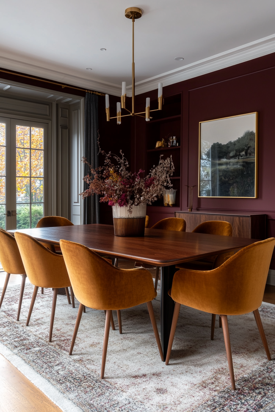
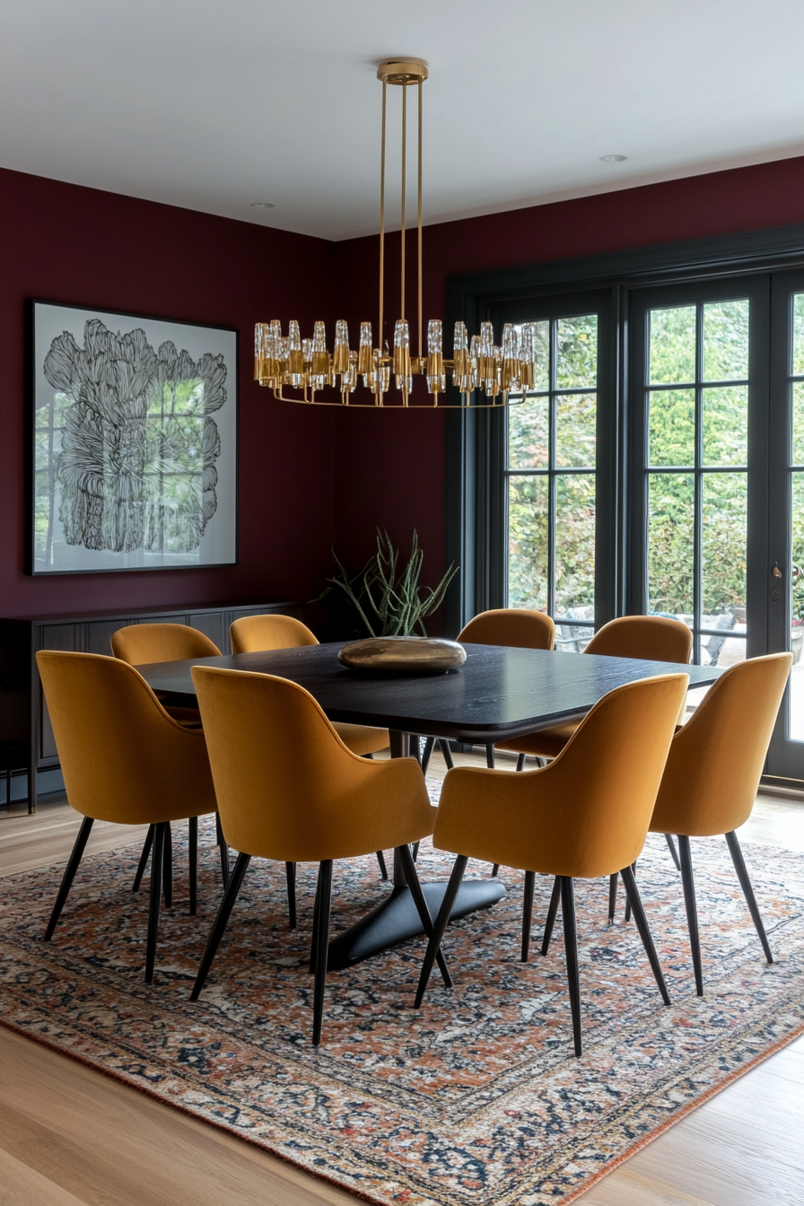
The richness of burgundy and the earthiness of ochre yellow create a warm and inviting palette. This combination feels sophisticated and timeless, perfect for dining rooms, entryways, or cozy living spaces. It’s a bold pairing that still feels approachable due to its natural undertones.
How to Implement
A. Walls and Trim
- Burgundy Walls: Paint walls in a deep burgundy for a dramatic effect.
- Ochre Trim: Add ochre trim or molding for a pop of contrasting color.
B. Upholstery
- Ochre Sofa: Use an ochre yellow sofa as a statement piece.
- Burgundy Pillows: Accent the sofa with burgundy throw pillows for cohesion.
C. Decor Elements
- Metallic Accents: Add brass or gold decor to elevate the warm tones.
- Wooden Furniture: Use dark-stained wood to enhance the richness of the palette.
Styling Tip
Pair with textured fabrics like velvet or wool to enhance the luxurious feel of this palette.
15. Forest Green and Bright Orange
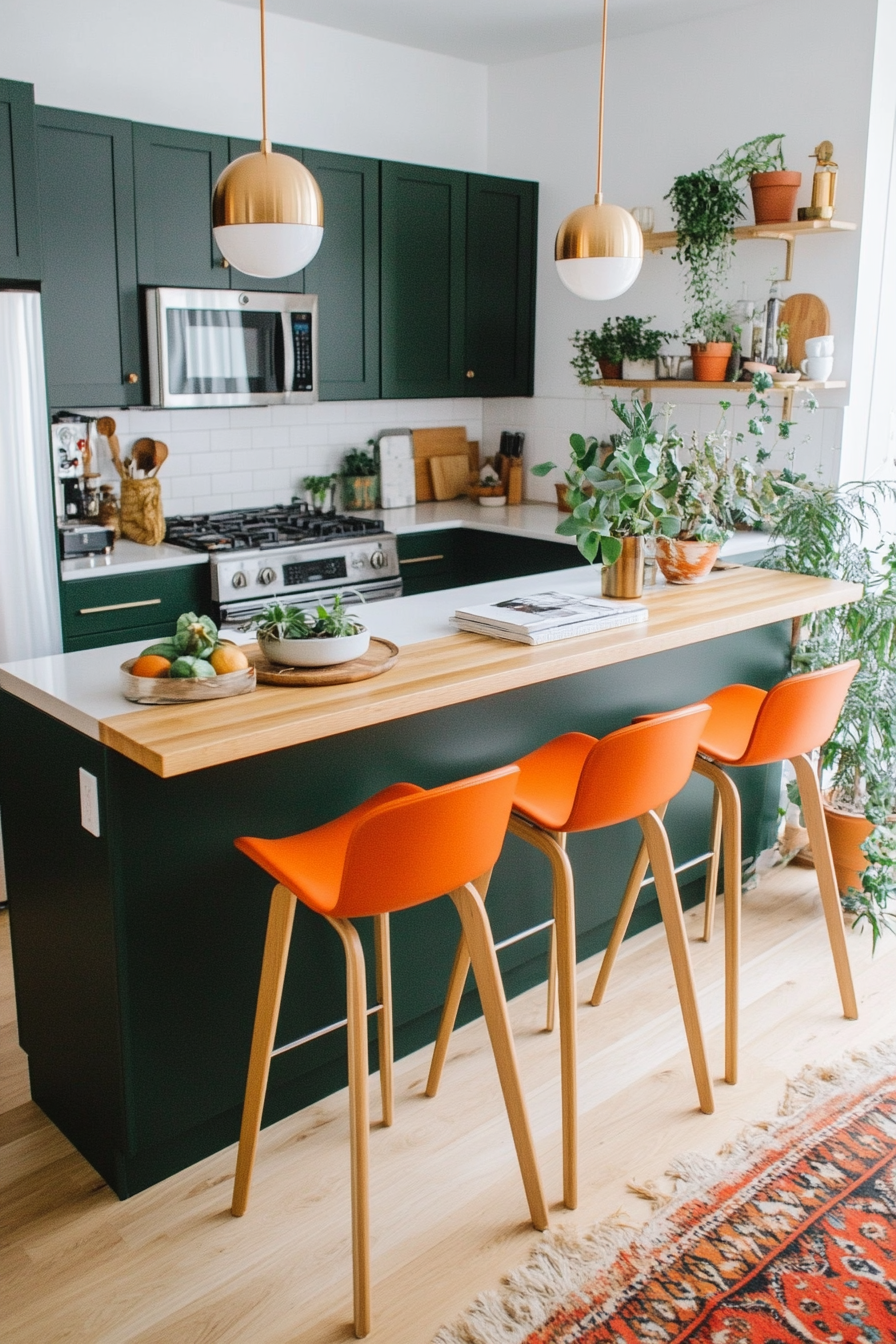
Why It Works
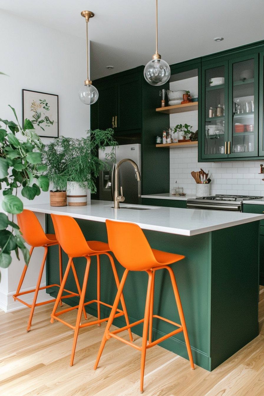
Forest green and bright orange make a bold yet earthy statement. The deep green adds a sense of calm and grounding, while the vibrant orange injects energy and excitement. This palette is great for lively areas like kitchens or living rooms where you want a fresh and dynamic atmosphere.
How to Implement
A. Furniture and Walls
- Green Accent Walls: Use forest green on walls for a natural, enveloping feel.
- Orange Chairs: Add bright orange chairs or barstools for a playful pop.
B. Decor Accents
- Green and Orange Artwork: Choose pieces that incorporate both colors for balance.
- Patterned Textiles: Use rugs or curtains with geometric patterns in these shades.
C. Mix with Neutrals
- Neutral Furniture: Balance the bold colors with white or cream sofas.
- Wooden Accents: Add light wood tones for a fresh, organic feel.
Styling Tip
Bring in plants to tie the forest green into the natural elements of the space.
